What are colours and how does light creates the colour variations
Without the light there would be no colours visible to humans
Colours will look different depending on lighting conditions and pigments used.
Over exposure or light deficiency and light frequency will dramatically effect the rendering of colour beyond believe!
We often take this phenomenon for granted, but do we actually realise it when incorporating colours and lighting in interior design?
Our eyes are like very sensitive sensors to the light radiation - a receptors design for only very small spectrum light - the sun light as seen from the surface of Earth. The purest source of light, the sunlight appears yellow - at high intensity it’s bright white.

Image result for ray of sunlight frequency The truth is it is not just yellow or white, it is a spectrum of many different types within. A rainbow is the classic example of the visible spectrum to human eyes. Every individual colour is a representation of slightly different frequency of radiation, but if you bunch them together they look like white light.
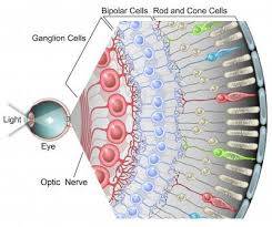
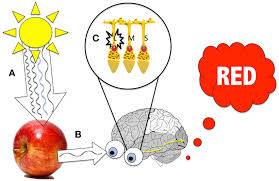
Image result for human eye colour receptors Image result for human eye colour receptors
Now the here is the twisted bit. Any pigment in any pot of paint or an ink or a dye or a fruit or what ever we see as colourful works like this: We will use a red apple pigments as an example. A sunlight lands on a red wall paint that contains a red pigment. Red pigment is a chemical that is capable of absorbing all sunlight frequencies, but the frequency that appears red inside human eye. Crazy, I know!
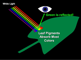
Image result for pigments and light absorption
So, now imagine if we change the sunlight for lower quality light - LED. Imagine you are colour matching two different vendors of paints who use different formulas to create similar looking colour under sunlight - will it look the same under LED light?
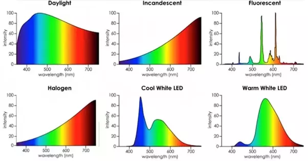
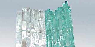
Glass is made form molten quartz sand. Glass will inherit certain colour hues derived from amount of iron within the sand. Every batch of send is also different. As it may appear transparent it is not exactly pure material nor it is smooth and flat as it looks at first glance. But let’s talk about the hidden hues of the glass. Although modern glass can be very much purified and iron content is almost completely eliminated, cost is becoming another factor and so many large to medium size glass processing factories opt in for low quality - better priced glass.
Glass is painted at the back side, so the finished product is very smooth, easy to clean and glossy. The subtly light green-ish or blue-ish hue creates sort of a colour filter. This effects some colour rendering more than others. The most effected colours are Creams and Whites. Painted glass is a difficult task to colour match. With all these factors - different quality of interior lighting, different paint vendors, different glass vendors the only way to really guarantee the consistency of a colour tone stick to these simple rules:
- request a larger physical sample
- always compare colours of different materials under the same conditions - same angle and source of light, same time of the day
- avoid colour matching of different materials where possible and opt in for contracting or complimentary colours instead
- always stand back, don’t inspect too closely (min. 2m)
- if possible have all the glass cut from the same batch
- use the same suppliers
- be prepared to accept tolerances
- if you’re unsure alway consult professionals
Check out our Colour & Design page for more details on choosing the righ colour, pattern or design or choose to browse our splashbacks by colour.


